Welcome back to another installment of our “Defining Characteristics” series, where we highlight the attributes of a particular architectural style. This time around, we’re focusing on the defining characteristics of Tudor architecture in America.
The original flourishing of Tudor residential architecture in America ran from the late 19th century to the depths of the Great Depression. There are plenty of pieces on why this came to be, but to quickly summarize most of them: Tudor architecture was seen by many as a respectable option for a better class of house, when the prevailing Victorian and Renaissance styles were thought to be garish or otherwise inappropriate.
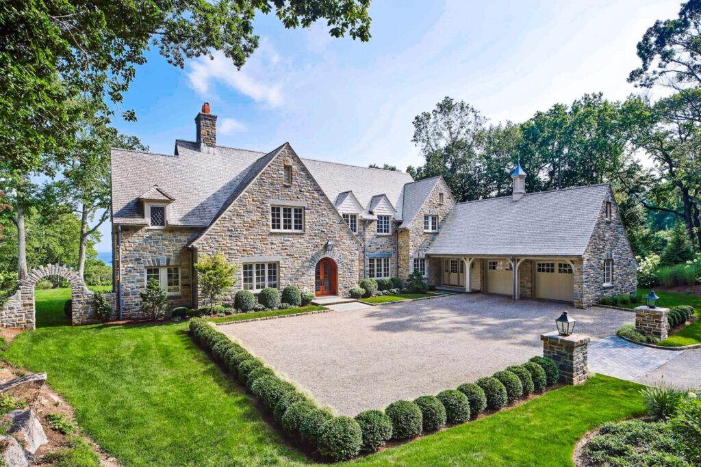
Our Hilltop English Country project
The best examples were well-researched adaptations of Elizabethan architecture; the worst were little more than standard house designs of the era with brown boards applied to them – charming perhaps, but not the same. There was also a revival of sorts from the mid-60s through the late-80s, most of which made the lesser-quality homes of the original flourishing scholarly in comparison.
While it’s not our most frequently requested style, we have worked on a number of Tudor homes over the years and always make a point of studying the historical aesthetics of the style and how to blend them appropriately with the clients’ needs and modern living. Below we’ll discuss some of the areas where Tudor architecture has flexibility as well as some rules to not cross, lest you end up with a expensive knockdown.
7 Features of English Tudor Architecture
Characteristic #1: The Plan
Most architect-designed Tudor homes have forms that are in keeping with their Elizabethan forebears. In most cases, they were one room deep, and the principal portion was either a long and narrow rectangle, a variation of a cross, or in the shape of the letter “E” (it has been suggested that this was in honor of the reigning monarch). A typical spec house layout (which is to say, a deep box with an integrated garage) won’t really work for a Tudor.
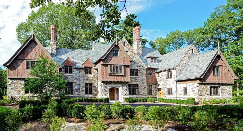
The entire design of our Mid-Country Tudor residence is one room deep.
Characteristic #2: Surprisingly Practical Detailing
While Tudor homes have a reputation for being heavily detailed, and they can be if that’s what you aim for, the surprising reality is that most of the detailing on a typical Tudor is very practical and quite simple when broken down. For instance, brackets were only added when an overhang needed extra support (and that overhang always served a necessary purpose) and eaves at stone were little more than the stone wall meeting the roof slates.
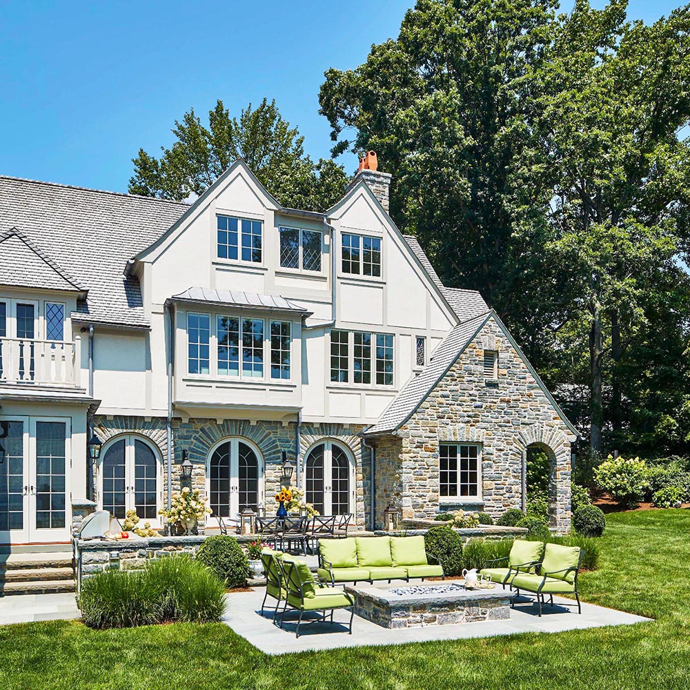
Simple yet attractive detailing
Characteristic #3: Timbers (usually)
There is an expectation that Tudor homes have timbering, and most do, but there are a few options. The first thing to consider: Is it structural (or meant to look like it is), or is it decorative? The second question is: What will the infill be? Both are a matter of preference in past and present American examples, and there wasn’t even always a definite answer in Elizabethan times.
Decorative timbering (“half-timbers”) can be highly stylized and creative, but it typically looks like an applique. In this case the infill should be stucco. Structural timbering will typically be tighter in layout and can accommodate stucco or brick infill. The brick patterns can be quite original. In one of our projects the brick infill became a outlet for creativity and the client and designers incorporated more than sixty distinct brick infill patterns! Up to four is usually a sufficient level of variety.
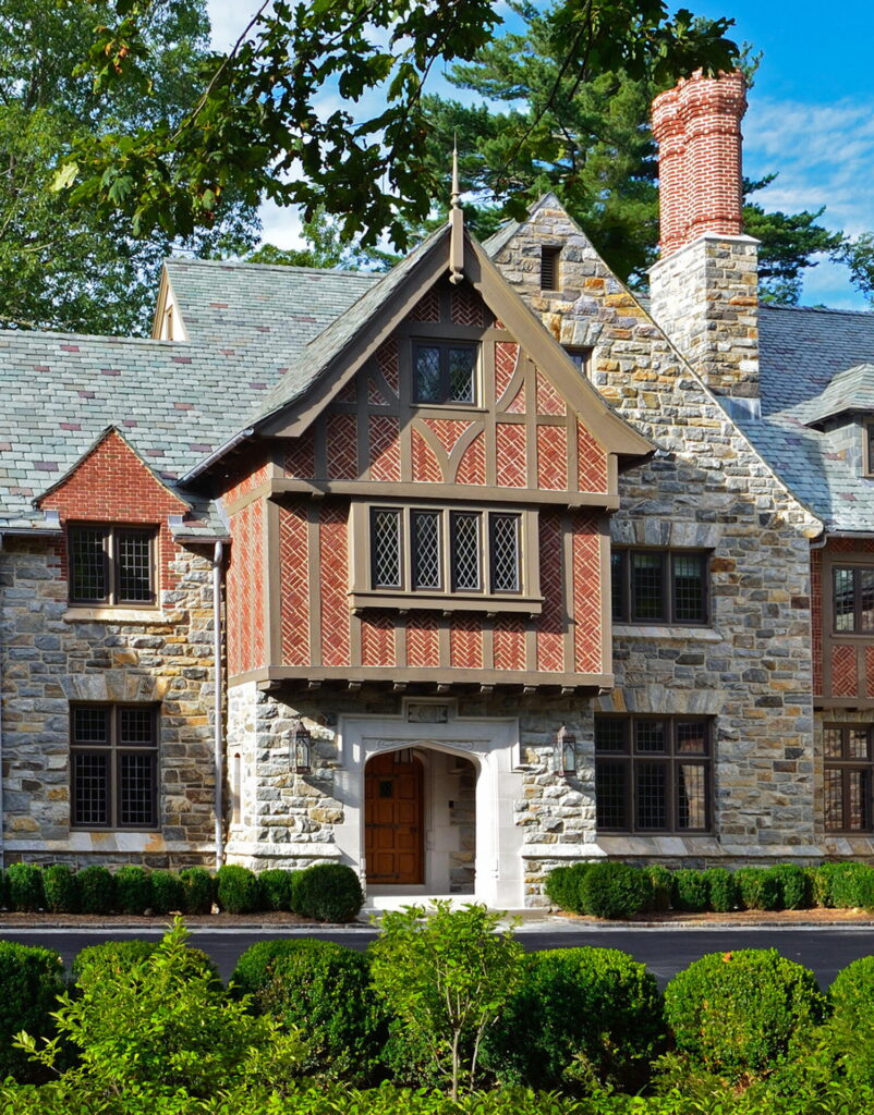
At our Mid Country Tudor, wire-brushed structural timbers with brick infill were used.
Then there is the question of timber finish: Flat-sawn boards, unless the work is very stylized, typically don’t give a design justice. Plain timbers will develop character over time, but adding a wire-brushed finish adds an extra dimension at relatively little cost. Adzed surfaces (a scooped hand hewn finish) give the most authentic finish of all. After texturing the timbers as desired, we typically apply a solid-body stain to preserve the appearance and material.
Characteristic #4: Other Building Materials
Like most other vernacular styles, Elizabethan homes typically employed materials that were readily available. Fast forward to current iterations and you’ll find that most homes have a base of brick or stone and (half-)timbering where it’s deemed appropriate. Beyond that, you can also find clay tiles at roofs and overhangs, stucco or rough-hewn clapboard siding as a secondary wall finish, slate as an option for roofs, etc.
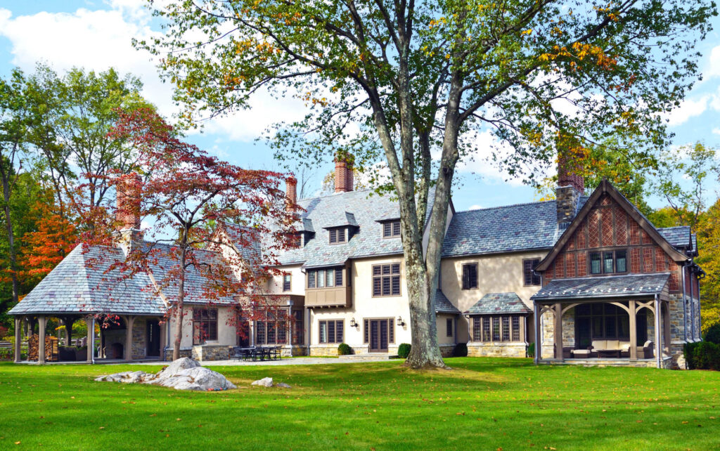
Most of our Tudor designs have stone as the primary wall material. A creative way to stay budget conscious is to employ the use of stucco at the side wings or rear of the home.
Characteristic #5: Windows and Doors
As double-hung windows were basically unheard of until the 17th century, casements are the typical window type in Tudors by default. Wood and steel were both common in the early 20th century, and both are appropriate options for the northeastern US. Muntins can be wood or leaded, and panes should be smaller than what is common today with a consistent modularity throughout.
There are a number of appropriate options for entrance doors, and again, appropriate study is required. Given the typical color schemes of Tudor homes, window and door products that cannot be painted or stained should be avoided.
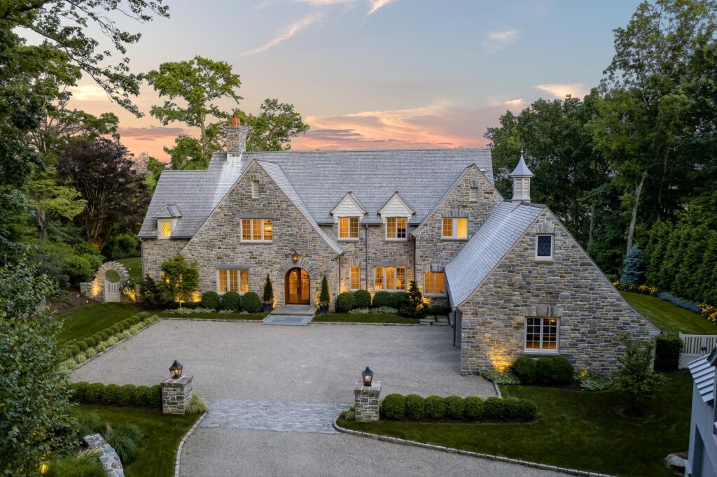
A typical roof pitch, used at our Hilltop English Country project
Characteristic #6: Steep Roofs
On a typical Tudor roof, anything with a pitch less than 13:12 is too shallow. How steep is appropriate depends on a number of design factors. Such steep roofs were likely employed for some combination of three reasons: First, steeper roofs shed water more easily, which was important in the days before flashings and waterproofing membranes were a universal concept. Second, they could allow for larger attics. Third, they make a shallow house look more substantial.
There are exceptions, of course. Sometimes, steep slopes simply won’t work and the additions and modifications to the original homes become part of the appropriate detailing. Pictured below, a shed dormer, entrance portico, and bay window were added to this Tudor by our team as appropriate additions that do not follow the pitch guidelines. Additionally, the starting points of roofs (“eaves”) may kick out at a shallower pitch, especially to provide shelter from the elements near entrances (as shown below) or simply where a nice design intervention is needed.
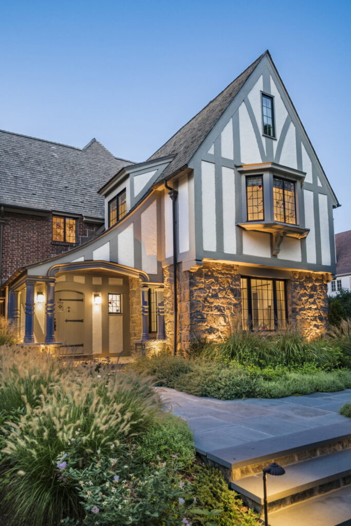
Our Charming Tudor Entrance renovation
Characteristic #7: Prominent Chimneys
Quite literally the icing on the proverbial cake, Tudor chimneys can be quite elaborate and prominent – and even misleading. In the days of one fireplace for every room, chimneys were seen as a status symbol, and adding false chimneys to give the impression of having more rooms than actually existed was quite common!
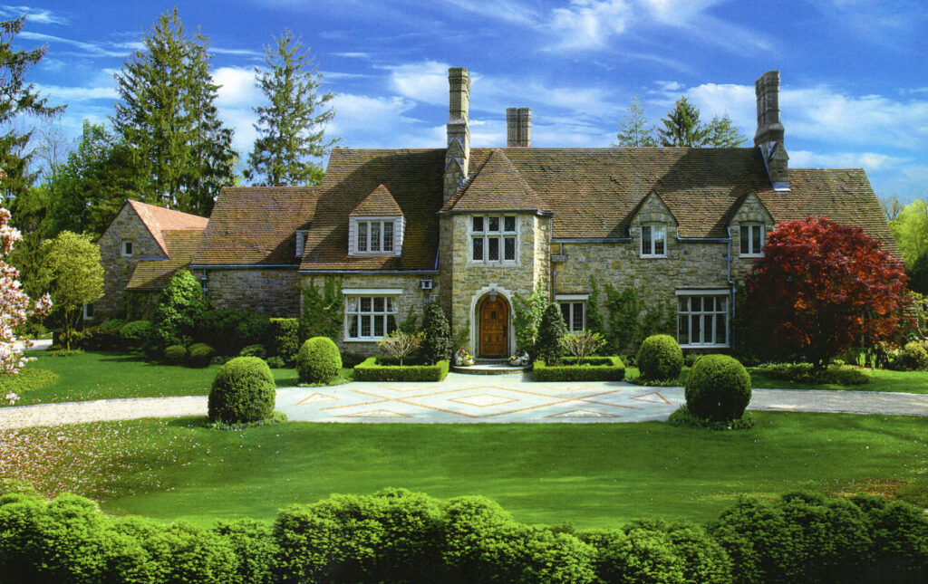
One final thought related to this topic: A lot of people lump in French Norman styled buildings with Tudor work. Having done a few over the years, we can assure you that while the two styles have a fair number of similarities, they are not the same when done correctly and are architectural cousins at most. French Norman architecture, for a start, has much quirkier detailing.
Interested in reading more? Check out our additional articles in this series:
- Defining Characteristics of Georgian Architecture
- Defining Characteristics of Colonial Architecture
- Defining Characteristics of Shingle Style Architecture
With four articles in this series, we have covered the styles that the majority of our designs fall under. That being said, we have undertaken many projects in other styles and can create your masterpiece in whatever tradition you prefer. Contact us for thoughtful residential design in the style of your choosing! Reach out to us at info@vanderhornarchitects.com or (203) 622-7000 to discuss your vision for your new home.